BRAND
GUIDE
LOGO
PRIMARY MARK
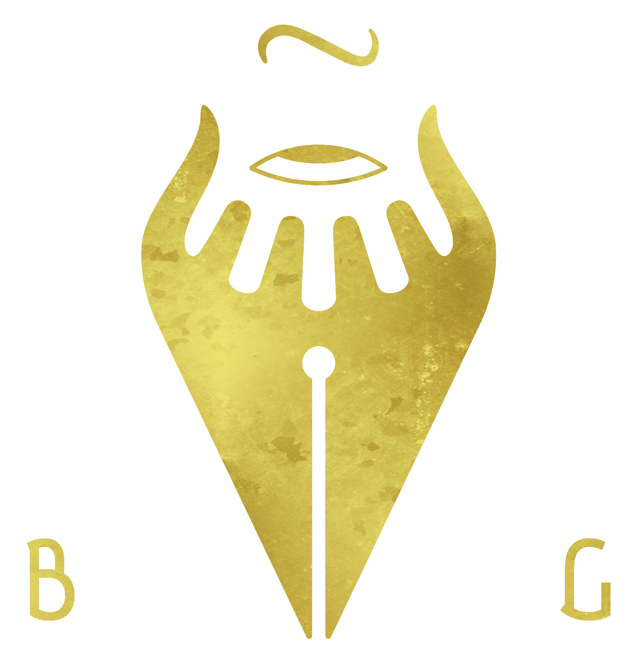
BG Creative’s primary logo mark is used on letter heads, business cards, social media profile images, and instances where the company is being overtly referenced/recognized, like sponsorships & partnerships.
FONT MARK

When space permits, the CREATIVE font mark may be included centered below the primary logo, with some additional space. It may also be used in stand alone horizontal circumstances, like social media cover images.
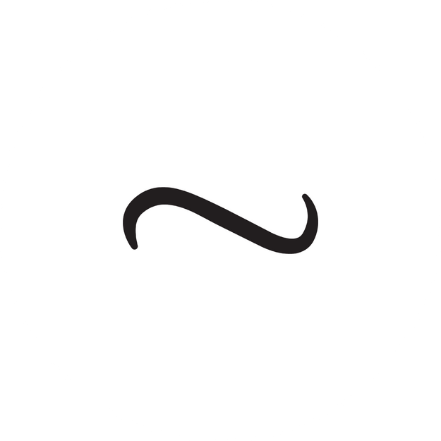
SQUIGGLE MARK
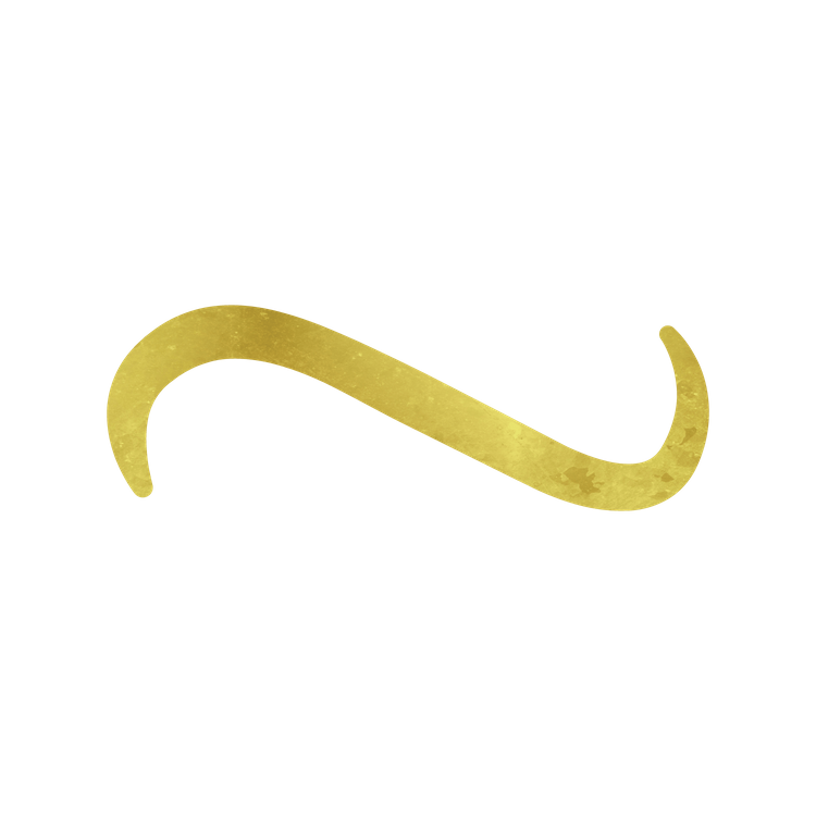
The squiggle mark is used in more subliminal and less overt forms of branding, or when space does not permit for the primary mark. The favicon, apparel, or in videos are examples of when this would be used.
FONTS
AUBREY
This font should only be used in the most important hierarchical circumstances, such as the name of BG Creative itself, or the two prongs in which the company operates: Design & Production.
Weight: regular
Line Height: 120%
Letter Spacing: 5pt
SPECTRAL
This font is used in headers. It is always uppercase with a 1px solid text shadow to give it contrast against the background where it’s implemented.
Weight: bold
Line Height: 120%
Letter Spacing: 3pt
CARDO
This font is used in general copy.
Weight: regular
Line Height: 120%
Letter Spacing: 0pt
COLORS
PRIMARY PALLET
#231F20
#000000
#D2C151
#ED2B00
#FFFFFF
SERVICES PALLET
#02001C
#260000
#541D00
#002608
#331700
